Stick-O
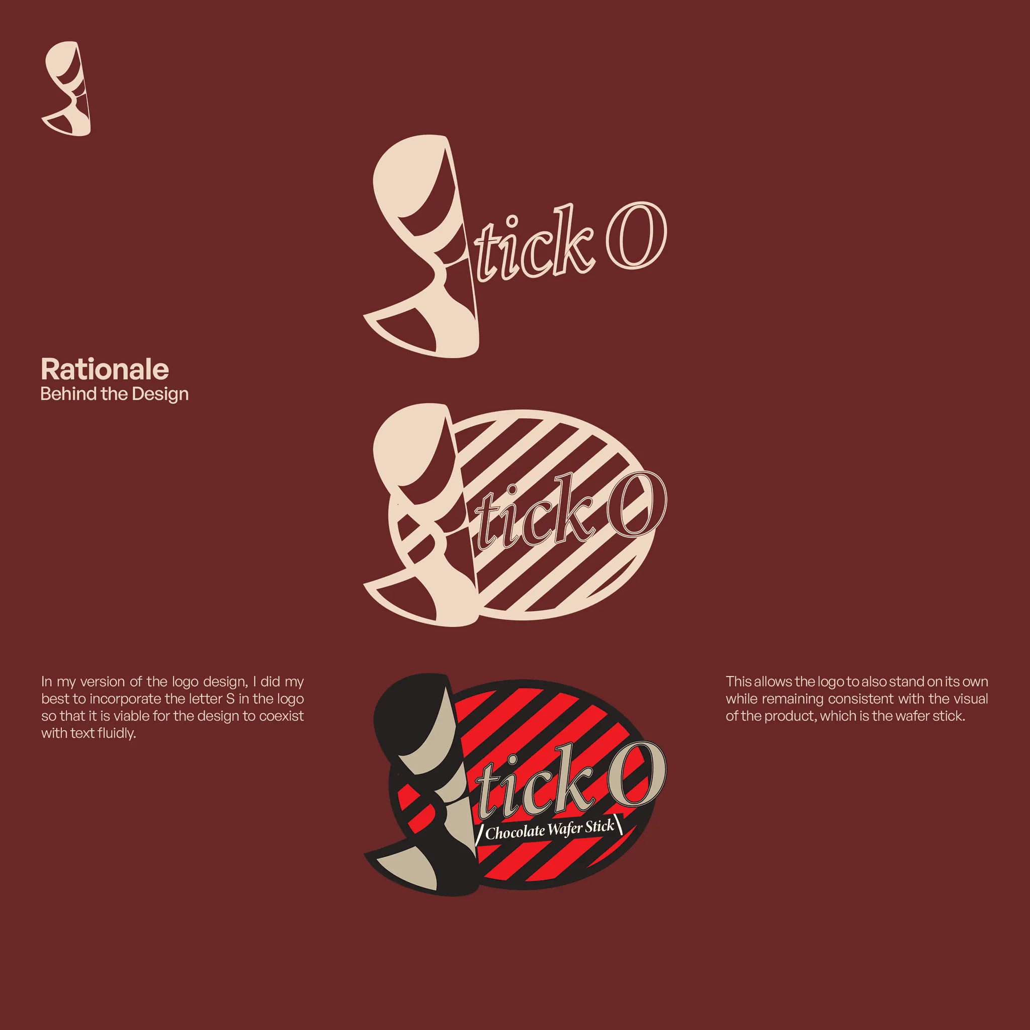
This project visualizes my own version of the Stick-O logo design, I did my best to incorporate the letter S in the logo so that it is viable for the design to coexist with text fluidly. This allows the logo to also stand on its own while remaining consistent with the visual of the product, which is the wafer stick.

PROJECT INFO
Reimagining this snack which resonated with a lot of kids back then, I made an attempt on creating an alternative design. I used Adobe Illustrator for the Logo Design itself, and Adobe Photoshop to curate and layout the presentation of the rationale behind this design as well as the logotype itself.